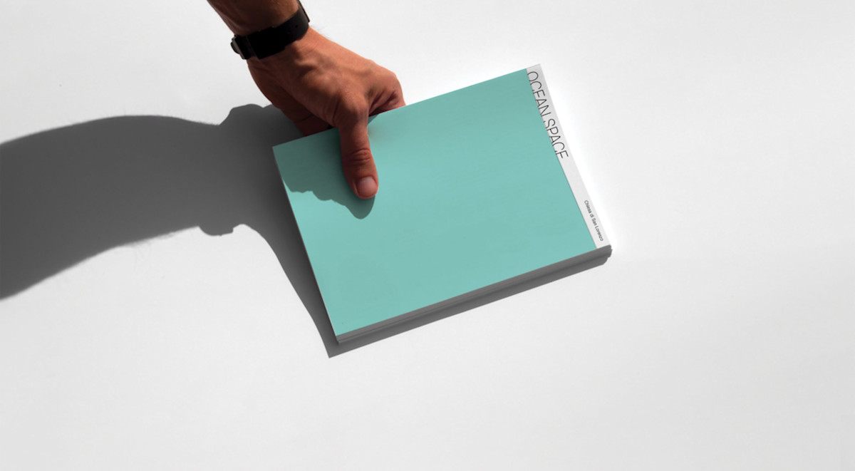
Crafting a digital place for Ocean Space, a collaborative platform for Ocean Imagination and Ocean Action.
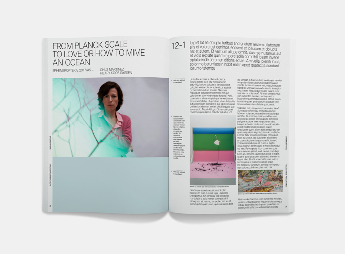
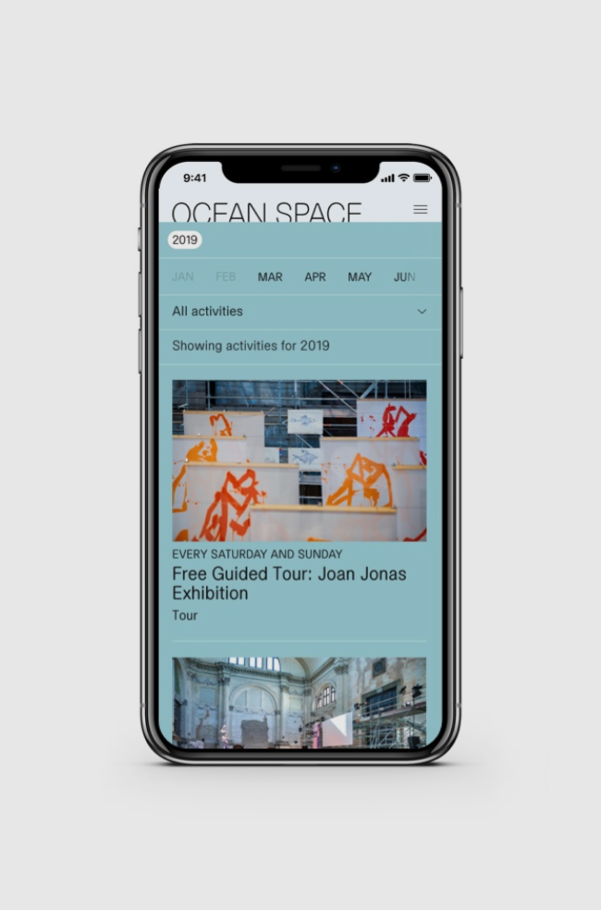
In March 2019, I had the opportunity to join forces with Base Design on a very special project. The project entailed creating a website based on a branding they created for Ocean Space, an art venue in Venice.
The main challenge of this project was a very limited time span. The full brand identity, digital design, and development had to be done within a month. Because of this, we chose to work in an agile way. This way of working really appealed to me, as it allowed me to work closely with the developers and learn a lot through that.
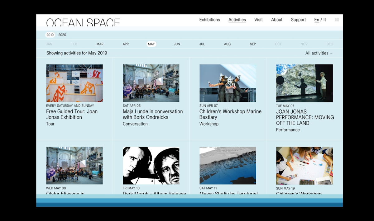
“The main concept of Ocean Space’s identity was horizontality”
Horizontality was my main focus to translate into digital. On the website you can see that it's applied almost anywhere. As you can see above we have applied this concept to the activities calendar as well. A full-width picker allows you to browse through the activities, while still being accessible. This is my personal favourite part of the website.
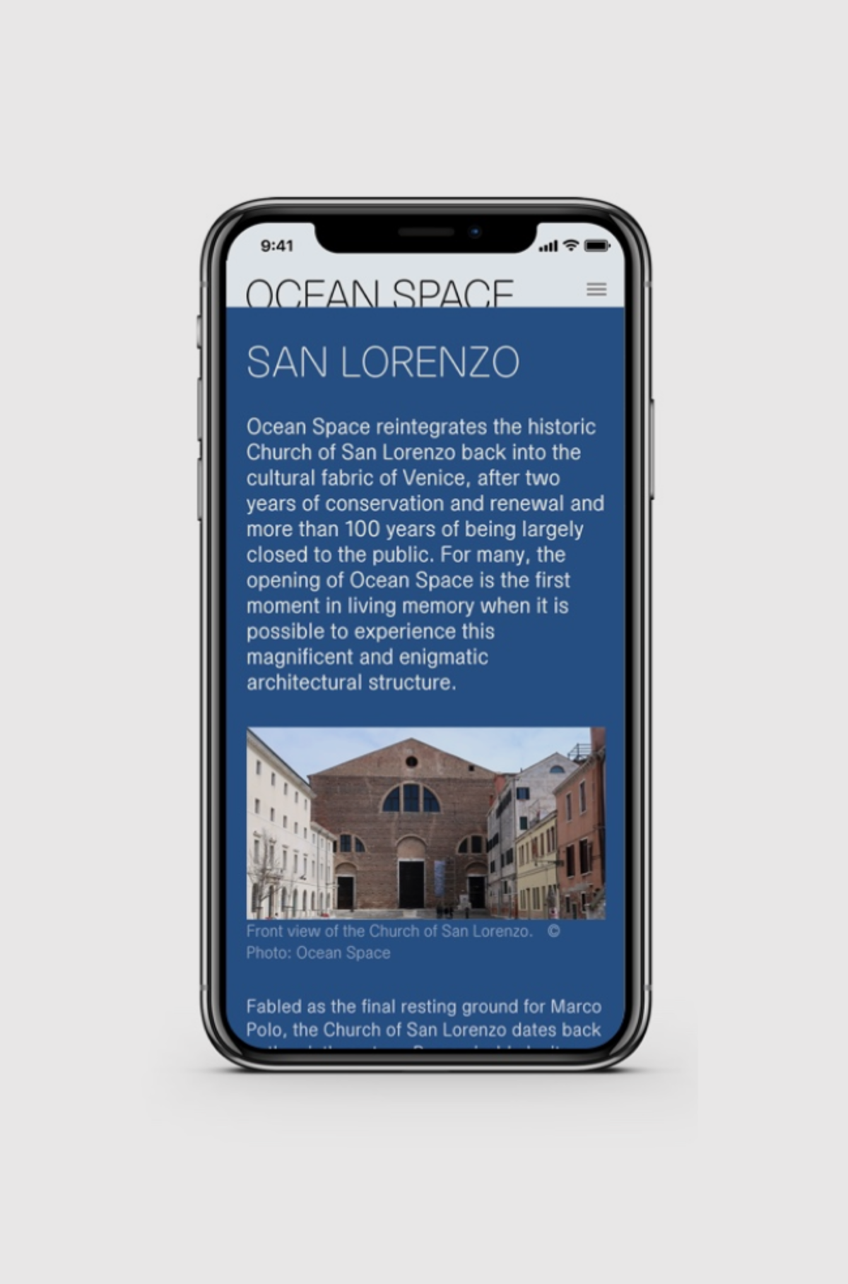
Because of the close deadline, we tried to work component based. This meant that throughout the website, we could repeat components in different places. It definitely saved the developers some time! You can especially see this on all of the content pages, which have the same general layout, with the same component possibilities.
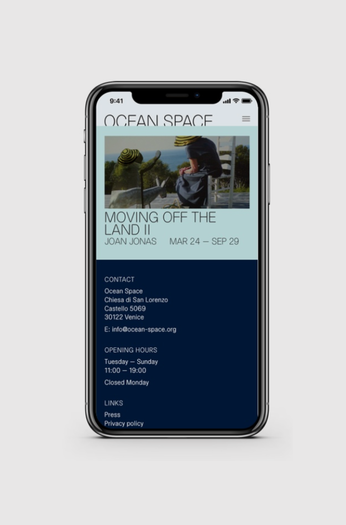
The layout of the Activity Detail and Exhibition Detail, was purposefully designed differently than the content pages. In this way people can easily differentiate an exhibition, an activity or a general content page just by looking at the page.
Credits
Branding & Print Design by Base Design BRU
Imagery by Ocean Space